
Understanding Daily Charts: Your Guide to Smarter Trading and Investing
Hey there, young investors and curious minds! Have you ever wondered how traders and investors keep tabs on the stock market every single day? They use something called a “Daily Chart.” In this article, we’ll explore the world of daily charts, an essential tool in the trading and investing universe.
Table of Contents
So, why should you care about daily charts? These handy graphs help traders make important decisions by showing how a stock’s price changes over time. It’s like having a daily diary of a stock’s journey! We will break down what daily charts are, how to read them, and why they’re so useful.
By the end of this guide, you’ll feel like a market wizard, understanding the basics and how to leverage these charts to your advantage. Get ready to impress your friends with your new stock market savvy! Let’s dive in and unravel the secrets of daily charts together.
WHAT IS A DAILY CHART?
Definition and Basics
Alright, let’s get into the nuts and bolts of a daily chart. Imagine a daily chart as a visual diary of a stock’s performance over days. Instead of words, it uses data points to show the highs, lows, and stock opening and closing prices each day. This nifty tool is a go-to for traders and investors to track how stocks behave over time.
In the world of trading, these charts are a key instrument. They help you see patterns and stock price trends, giving clues about when to buy or sell. It sounds fancy, but it’s just a way to track what’s happening in the market daily.
Structure of a Daily Chart
Now, let’s break down the structure of these charts. The daily chart has two main axes. The bottom axis (or horizontal one) represents time, usually divided into days. The side axis (the vertical one) shows the stock price. So, you have a timeline at the bottom and dollars (in most cases) climbing up the side.
You’ll often see different styles of these visual aids. Three common types are line charts, bar charts, and candlestick charts. Line charts are pretty straightforward—they show a simple line that traces the stock’s closing price over days. Bar charts are a bit more detailed, showing not just the closing price but each day’s high, low, and opening prices with vertical bars. And then there are candlestick charts—these might look a bit complicated, but they offer a ton of information in an easy-to-read format, showing opening, closing, high, and low prices with a nifty colour-coded system.
Why Use a Daily Chart?
So, why bother using these daily charts? There are quite a few reasons. For one, they’re fantastic for monitoring stock movements day by day. They can help you spot trends and make informed decisions about investing or selling. If you compare them to weekly or monthly charts, daily charts give you that up-to-the-minute detail that can be crucial for short-term trading strategies.
Moreover, these diagrams are not just for day traders. Long-term investors can also find value in daily charts as they can reveal patterns and trends over extended periods when stacked together. You can think of them as the groundwork for building a bigger picture of market movements.
In short, daily charts are your best friends when it comes to staying on top of stock performance, whether you’re in it for the short game or the long haul. They let you see each day’s story, helping you make smarter, more strategic decisions. So, keep these graphs close—they’re invaluable in your trading and investing toolkit!
Interpreting Daily Charts
So you’ve got the basics down pat. Now, let’s dive into the fun part—figuring out what all those squiggly lines and colourful bars mean. You might think it’s all a big mystery, but trust me, it’s not as tricky as it seems.
Reading the Basics
First, let’s get comfy with the key elements on your chart. Every daily chart will show you four main points for each day: the opening price (where the stock started the day), the closing price (where it ended), the highest price (the peak), and the lowest price (the dip). These are often displayed using candlesticks or bars, making it easy to spot trends.
Candlesticks might look complicated, but they’re pretty straightforward. A green (or white) candlestick usually means the closing price was higher than the opening price—think of it as a good day for the stock. A red (or black) candlestick means the opposite, indicating a drop in the stock’s value. Pay close attention to these because they can reveal the market’s day-to-day sentiment.
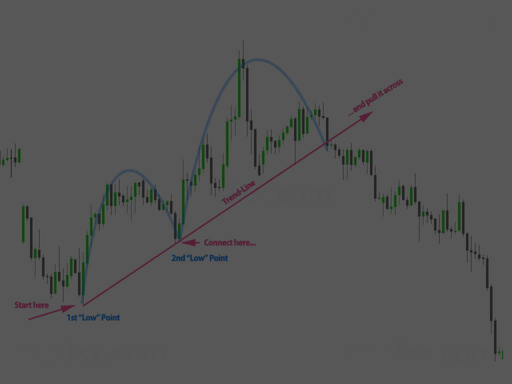
Common Chart Patterns
Now, on to something a tad more advanced—chart patterns. These patterns pop up repeatedly in historical data and can give clues about where a stock might be headed. Here are a couple of famous ones:
Head and Shoulders: This pattern resembles its namesake and suggests that a stock is about to reverse its current trend.
Double Top/Double Bottom: These patterns resemble the letters ‘M’ for tops and ‘W’ for bottoms, indicating that a stock might change direction.
Recognizing these patterns can make you feel like a detective on the trail of a big lead. They’re like little hints the market leaves behind for those keen enough to notice.
Indicators and Tools
No detective walks the streets without some handy tools. In the world of daily charts, we call these tools indicators. They help confirm what you see in the chart patterns, making your predictions more reliable.
Moving Averages (MA) average a stock’s price over a certain number of days, smoothing out short-term fluctuations and highlighting longer-term trends.
Relative Strength Index (RSI) measures how quickly a stock’s price changes, revealing whether it’s overbought or oversold.
Using these indicators effectively involves placing them on your chart and watching how they interact with the stock’s price movement. Moving Averages, for instance, can act as a boundary; if the stock price crosses it, that might suggest a significant trend change. Meanwhile, RSI can help you decide if a stock’s current price is reasonable or if it’s being driven by too much hype.
Pulling It All Together
Interpreting daily charts is like learning a new language. At first, it might feel foreign, but it becomes second nature bit by bit. Once you grasp how to read the basics, spot common patterns, and utilize your indicators, you’re well on your way to making more informed trading or investing decisions.
No one becomes a chart wizard overnight, so give yourself time to practice and get a feel for the market’s rhythms. With each look at your daily chart, you’ll get more comfortable and start recognizing the signals and patterns that can help you confidently navigate the trading waters.
Putting Daily Charts into Practice
Alright, you’ve got the basics down about daily charts – now it’s time to dive into how you can put this knowledge to work. Let’s look at some practical steps and tricks to help you get the most out of these charts.
Creating and Customizing Daily Charts
First, you need to set up your daily chart. Whether you’re using a popular trading platform like TradingView or software that came with your brokerage account, setting up a daily chart is usually straightforward.
- Getting Started: Open your trading platform and navigate to the charting tool. Select the stock you want and set the time frame to ‘Daily’.
- Customizing Your Chart: Most platforms allow you to customize the appearance of your charts. You can change the colours, add grid lines, and choose between different types of daily charts (candlestick, bar, or line). Find the settings and play around until the chart looks clear and easy to read.
Remember, there’s no one-size-fits-all when it comes to charts. Your preferences might differ from someone else’s, and that’s totally okay. The goal is to make the chart work for you.
Analyzing Real Examples
Theory is great, but real-world examples bring everything to life. Let’s look at some actual daily charts to understand stock movements better.
- Example 1: Imagine looking at a daily chart for Apple. You can see the price movements for each day—some days, the price goes up, and some days, it goes down. You can see patterns forming by examining the open, closed, high, and low prices.
- Example 2: Consider a chart showing Tesla’s stock. You might spot a double-top pattern, which can signal a potential drop in price. Recognizing these patterns helps you make educated guesses about future movements.
I am breaking down real examples like these aids in connecting the dots between theoretical knowledge and actual market behaviour.
Developing a Strategy
Daily charts aren’t just for observation – they’re essential tools for building your trading or investing strategy.
- Day Trading: If you’re into day trading, daily charts help gauge the overall market sentiment and make quick decisions.
- Swing Trading: Daily charts can be useful tools for swing traders to spot short—to mid-term trends and swing points.
- Long-Term Investing: Even for long-term investors, daily charts provide insights into market entry and exit points, ensuring you optimize your buying and selling.
Developing a strategy involves using the patterns and indicators you’ve learned about and applying them to make informed decisions.
Stick to these steps, keep practising, and you’ll find daily charts invaluable in your trading toolkit. Happy charting!
Conclusion
So, now you’ve made it to the end of our deep dive into daily charts! Hopefully, you’re feeling much more confident about what they are and how to use them to up your trading game.
Daily charts are like a trader’s best friend. They help you keep a close eye on how stocks are moving day by day, which is super handy whether you’re just starting out or if you’re an experienced investor. They give you a clear, visual way to track patterns, trends, and potential opportunities.
Remember, getting the hang of reading daily charts takes some practice, but don’t get discouraged. Start by focusing on the basics: understanding the main components like the time and price axes and getting familiar with different chart types like line, bar, and candlestick charts. These basics will be your foundation.
Once you’re comfortable with the fundamentals, dive into interpreting the charts. Look out for candlestick patterns and learn what they signify – they can tell you a lot about market sentiment. Don’t forget to explore common indicators like moving averages or RSI; these tools are your secret weapons for making sense of all the data.
Putting it all into practice is where things get exciting! Try setting up your daily charts using your favourite trading platform. Customize them to match your style – maybe you like bright colours or specific indicators. Check out real-life examples to see how theory turns into practice. And don’t be shy about developing your strategies and tweaking them based on what you see in your charts.
Finally, keep exploring and learning. The world of trading and investing is always evolving, and there’s always something new to discover. Use daily charts to your advantage and watch your skills and confidence grow.
Happy trading, and may your charts always guide you to smart decisions!
FAQ: Daily Chart
What’s a Daily Chart?
Q: What exactly is a daily chart?
A: A daily chart is a type of chart used in trading and investing that shows the price movements of a stock or other security over a single day. Each bar or candlestick represents one day of data.
Q: Why are daily charts important?
A: Daily charts are crucial because they help traders and investors monitor stock movements daily. This is important for making timely decisions and understanding short-term trends.
Structure of a Daily Chart
Q: What are the main components of a daily chart?
A: The main components include the time axis (horizontal), the price axis (vertical), and the bars or candlesticks that represent the stock’s daily performance.
Q: What types of daily charts are there?
A: The most common types are line charts, bar charts, and candlestick charts. Each one presents data slightly differently, but they all show daily price movements.
Using Daily Charts
Q: How do I use daily charts to monitor stock movements?
A: By regularly checking the daily chart, you can spot emerging trends, potential reversals, and other key movements that can inform your trading decisions.
Q: Are daily charts better than weekly or monthly charts?
A: It depends on your trading style. Daily charts are great for short-term trading and quick decision-making, while weekly or monthly charts provide a broader view of longer-term trends.
Interpreting Daily Charts
Q: How do I read the basic elements of a daily chart?
A: Each bar or candlestick on a daily chart shows the open, close, high, and low prices for that day. Green or hollow candlesticks typically indicate a price increase, while red or filled ones show a decrease.
Q: What are some common chart patterns?
A: Common patterns include the head and shoulders, double top/bottom, and candlestick formations like dojis and hammers. These patterns can signal potential trend reversals or continuations.
Q: What technical indicators should I know?
A: Indicators like Moving Averages, Relative Strength Index (RSI), and Bollinger Bands are widely used tools that can help you analyze the data on daily charts more effectively.
Practical Application
Q: How can I set up a daily chart?
A: Most trading platforms and financial websites offer tools to set up daily charts. You can customize the chart by selecting indicators, setting time frames, and choosing chart types.
Q: Can you give an example of analyzing a daily chart?
A: Sure! Imagine a daily chart showing a stock that recently formed a “double bottom” pattern, typically indicating a potential uptrend. You’d use this insight to make informed trading decisions.
Q: How do I develop a trading strategy using daily charts?
A: Incorporate daily charts into your strategy by using them to time your entry and exit points, confirm trends with technical indicators, and adapt to market conditions. This is crucial for day trading, swing trading, and long-term investing.
I hope this helps! If you’ve got more questions, feel free to ask. Happy trading!
Helpful Links and Resources
We hope this glossary entry has given you a comprehensive understanding of daily charts, their structure, and how to use them effectively in your trading strategy. To further enhance your knowledge and skills, we’ve curated a list of valuable resources and links that delve deeper into various aspects of daily and other types of charts:
Daily Chart Definition, Uses in Trading Strategies – Investopedia: A detailed definition and explanation of daily charts, including their uses and benefits in trading strategies.
Understanding Daily Chart Trading Terms – Financial Source: A guide to common terms and concepts associated with daily chart trading.
Weekly Chart: Definition, Uses, Advantages, Vs. Daily or Monthly – Investopedia: Explains weekly charts and how they compare to daily and monthly charts, helping you understand when to use each type.
TradingView – Track All Markets: A powerful charting platform that allows you to create and analyze daily charts for various markets, including forex, stocks, and cryptocurrencies.
StockCharts.com – Advanced Financial Charts & Technical Analysis: Offers various charting tools and educational resources to enhance your technical analysis skills.
Long-Term Charts—TrendSpider Learning Center: This section discusses the importance of daily charts in short-term and long-term investing strategies.
- Tips for Stock Charts That Enhance Your Analysis – Investopedia: Useful tips and strategies for making the most out of your chart analysis.
Explore these resources to deepen your understanding and sharpen your trading skills. Whether you’re just starting or looking to refine your strategy, these links offer valuable insights to help you navigate the complexities of the market using daily charts. Happy trading!
« Back to Glossary Index