
Understanding Candlestick Charts: A Friendly Introduction
Hey there! Have you ever tried to make sense of those complicated-looking charts in financial news or trading apps? If yes, then this article is just for you. Today, we’re diving into the fascinating world of candlestick charts, an essential tool for anyone interested in trading.
Table of Contents
We’ll break it all down in simple, easy-to-understand language that’s perfect for everyone, from middle school students to adults. Whether you’re just starting out or have some experience, this guide will help you grasp the basics and the benefits of candlestick charts. Trust me, by the end, these charts will feel like old friends.
So, what exactly is a candlestick chart? To put it simply, it’s a way to visualize stock prices that originated in Japan hundreds of years ago. The name might sound fancy, but don’t worry—it’s easier to understand than you think. We’ll even compare it to other types of charts like line and bar charts, so you’ll see why candlestick charts are special.
Why should you bother learning about candlestick charts? Great question! These charts can help you make smarter trading decisions by showing you price trends and patterns. And this isn’t just for the pros—beginners can benefit a lot, too. Imagine being able to read market sentiment like it’s second nature!
Ready to become a candlestick charting whiz? Let’s get started!
The Basics of Candlestick Charts
Alright, let’s dive into the essential stuff about candlestick charts! You might have heard the term before, but what exactly goes into these charts? Well, they’re kinda like puzzle pieces of information that tell you a story about stock prices. Understanding the nuts and bolts can really help you see the big picture when trading.
First off, let’s break down the structure of a candlestick. Imagine a candle – you have the wax part (the body) and the wick. In trading, the body of the candlestick shows you the opening and closing prices of a stock for a certain timeframe. If the body is filled or coloured, it usually means the closing price is lower than the opening price (often called bearish). If it’s empty or a different colour, it typically means the closing price is higher (known as bullish).
Now, let’s chat about the wicks or shadows. These little lines sticking out from the top and bottom of the body represent the highest and lowest prices during the timeframe. Think of them as the high-fives and low-fives of trading, showing you the peaks and valleys.
Colors play a big role too. Traditionally, you’ll see white or green candlesticks when prices go up (bullish), and black or red ones when prices fall (bearish). But hey, don’t get stuck on colours! Some traders customize their charts with their favourite hues so they can quickly grasp what’s going on. You can do the same. Just remember, it’s all about keeping it clear and easy for you to read.
One more crucial thing – timeframes. Candlestick charts can represent different periods, like one minute, one hour, or one day. Imagine you’re looking at a stock and each candle represents a different photo snapshot in time. On a one-minute chart, each candlestick covers just one minute of trading action. On a daily chart, each candlestick tells the story of an entire trading day. This is super important because a stock might look one way when you’re zoomed in, and totally different when you zoom out. It’s like looking at a forest up close versus from a mountaintop—the perspective changes a lot!
Understanding these basics sets you up for a deeper dive into the world of candlestick charts. Trust us, mastering these will give you a solid foundation to build on. Ready for the next step? Let’s keep going!
Types of Candlesticks
Alright, now that we’ve got the basics covered, let’s dive into the different types of candlesticks you’ll encounter. Trust me, understanding these is like having a secret decoder ring for the stock market!
Single Candlestick Patterns
First up, we have single candlestick patterns. These ones are like quick snapshots of market sentiment. They can give you a lot of information just by themselves.
Doji: Picture this – the open and close prices are pretty much the same. It looks like a tiny plus sign or a cross. This pattern shows indecision in the market, meaning neither buyers nor sellers are in control.
Marubozu: This one’s like the superhero of candlesticks! It has no wicks at all, just a solid body. If it’s green (or white), it means super-strong buying pressure. If it’s red (or black), the sellers are in charge.
Hammer: Exactly as it sounds, it looks like a hammer. A short body with a long lower wick. This could mean that the market is trying to find a bottom – like someone hammering down to test the strength of the floor.
- Inverted Hammer: Just flip the hammer upside down. It could indicate that buyers are coming in, even though the day started off weak.
Double Candlestick Patterns
When we look at pairs of candlesticks, it’s like watching a mini-drama unfold on your chart. These pairs can give insight into what’s happening over two time periods.
Bullish/Bearish Engulfing: Imagine the second candle completely swallowing the first one. If a green candle engulfs a red one, it could mean a bullish turnaround. The opposite, a red candle fully containing a green one, might indicate a bearish reversal.
Tweezer Tops/Bottoms: Tweezer patterns are like twins. In a Tweezer Top, two candles hit the same high point, showing strong resistance. A Tweezer Bottom features two candles with the same low, indicating solid support.
Triple Candlestick Patterns
Now, for the triple threats. These patterns are more complex but can be incredibly telling about potential market moves.
Morning Star: Think of it as the dawn of a new bullish day. The pattern starts with a long red candle, followed by a small-bodied candle (showing indecision), and then a long green candle. It suggests that buyers are taking over after a downtrend.
Evening Star: This is basically the opposite of a Morning Star. It usually signals the start of a downtrend, with a long green candle, followed by a small-bodied candle, and then a long red candle.
Three Black Crows: Sounds ominous, right? This pattern includes three consecutive long red candles. It generally indicates that the bears are roaring, and the market might be heading downhill.
- Three White Soldiers: Here, we have three successive long green candles. It’s a strong sign that the bulls are charging ahead and the market sentiment is positive.
As you start recognizing these patterns, you’ll get a feel for what they each signal. Keep practising, and soon it’ll be like second nature. Remember, the key is to stay observant and not just rely on one pattern, but consider multiple factors before making any trading decisions. Happy charting!
Interpreting Candlestick Charts
Alright, so now you’re familiar with the different types of candlesticks and their patterns. Awesome! Let’s dive deeper and see how you can actually use these candlestick charts to make sense of the market.
Support and Resistance Levels
First things first—support and resistance levels. These are like the floor and ceiling of market prices. Imagine support as a trampoline where prices tend to bounce back up when they hit a certain low level. Resistance, on the other hand, is like a glass ceiling that prices struggle to break through.
Candlesticks can help you spot these levels. For example, if you notice several candlesticks hitting a similar low and bouncing back up, you’ve likely identified a support level. Similarly, if they keep hitting a high but falling back down, that’s your resistance.
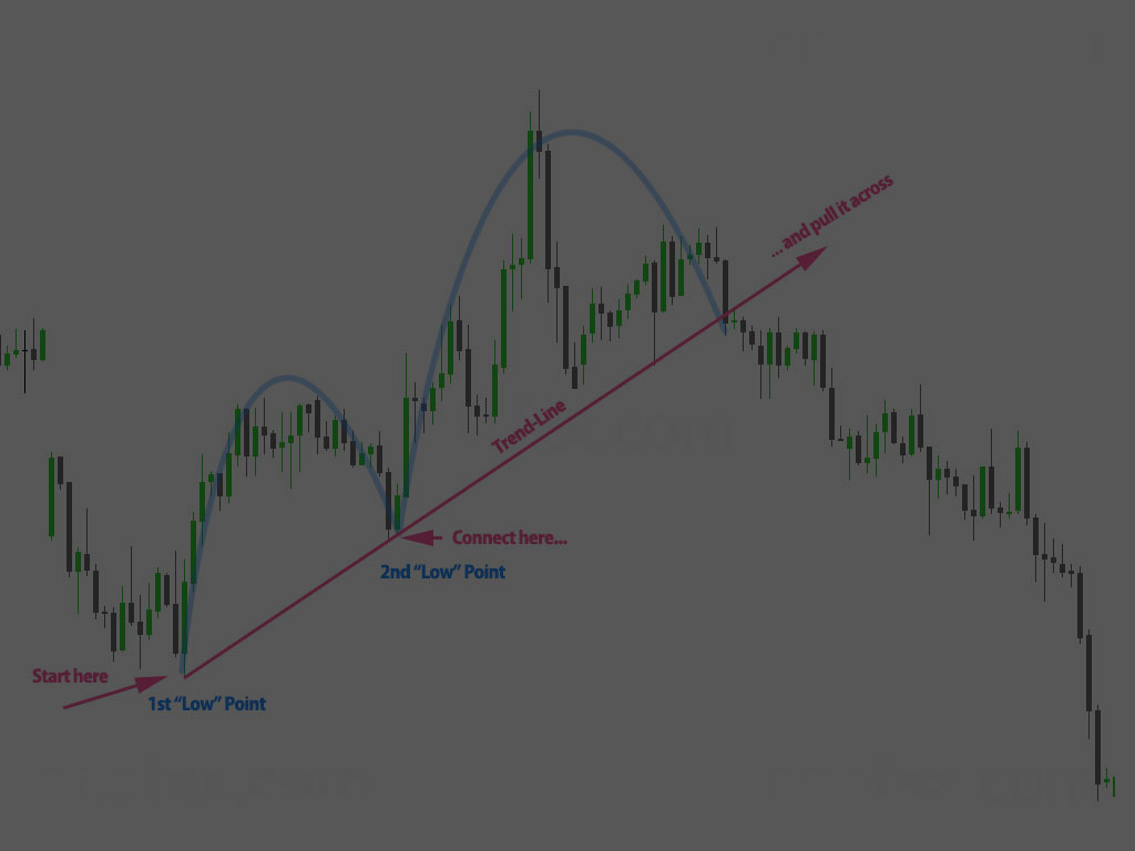
Trend Analysis
Next up, we’ve got trend analysis. Understanding the trend of the market can make a huge difference in your trading decisions. Trends can be up, down, or even sideways.
An uptrend means the prices are generally moving higher, while a downtrend indicates they’re heading lower. Sideways trends are like a seesaw where prices fluctuate in a narrow range without a clear direction.
Candlesticks come in handy here too. For instance, a series of bullish (upward) candlesticks can signal an uptrend, while a string of bearish (downward) ones can indicate a downtrend. Keep an eye out for consistent patterns to gauge the market’s direction.
Combining Candlestick Patterns with Other Indicators
Now, let’s spice things up by combining candlestick patterns with other technical indicators like Moving Averages, RSI (Relative Strength Index), and MACD (Moving Average Convergence Divergence). These tools can give you a more rounded view of the market.
Imagine candlestick patterns as your initial clues. When you pair them with, say, a Moving Average that confirms the trend, you get a stronger signal. For example, spotting a bullish engulfing pattern alongside an upward-moving average can give you more confidence in your decision.
Or consider using RSI, which tells you if a market is overbought or oversold. If you see a doji candlestick (which usually signals indecision) and an RSI close to 70, you might think the market could reverse soon.
Emotions and Psychology
Last but not least, let’s talk about the human element—emotions and psychology. Believe it or not, trader emotions play a huge part in market movements. Candlesticks are a pretty neat way of visualizing this.
For example, long wicks can show the market’s uncertainty. If you see a candlestick with a long upper wick, it could mean traders tried to push prices higher but couldn’t sustain it, indicating a potential reversal. This is where understanding market psychology comes in handy.
To be a successful trader, it’s crucial to stay objective and not let your emotions dictate your actions. Recognize patterns and trends based on data, not your gut feeling, to keep your trades grounded in logic.
So there you have it! With these tools and insights, you’re well on your way to mastering candlestick charts. Keep practising, and over time, interpreting these charts will become second nature. Happy trading!
Conclusion
Wow, you’ve made it to the end! Let’s do a quick recap of what we’ve covered about candlestick charts. You’ve learned about the basics of candlestick structures, the meanings behind different colors, and various timeframes. We’ve dived into single, double, and triple candlestick patterns, and explored how to interpret these charts to spot support and resistance levels, analyze trends, and even combine candlesticks with other indicators like Moving Averages and RSI.
Remember, becoming proficient in reading candlestick charts takes practice. Don’t get discouraged if it seems overwhelming at first; everyone starts somewhere. Take some time to practice identifying different patterns and try to apply what you’ve learned. Over time, these charts will become second nature to you.
A helpful tip is to start with one type of pattern at a time. Maybe spend a week just focusing on recognizing Doji patterns before moving on to something else. This way, you won’t feel swamped with information. Also, consider keeping a trading journal to track your observations and decisions. It’s a great way to learn from both your successes and mistakes.
Before you go, we’d love for you to check out more articles and resources on our website. There’s always something new to learn in the trading world! And hey, don’t forget to subscribe to our newsletter or follow us on social media for the latest tips and updates.
Happy trading, and may your charts be ever in your favour!
FAQ
Welcome to the Candlestick Chart FAQ!
What’s the purpose of this article?
This article is your go-to guide for understanding candlestick charts, whether you’re a newbie or a seasoned trader. We’ll break it down so you can make better trading decisions.
What exactly is a candlestick chart?
A candlestick chart is a type of financial chart used to describe the price movements of a security, derivative, or currency. Developed in Japan back in the 18th century, it’s a simple yet powerful tool to visualize market sentiment. Unlike line or bar charts, candlesticks offer a richer set of visual information.
Why should I learn about candlestick charts?
Candlestick charts help traders predict price movements better by showing the high, low, open, and close prices all in one “candlestick.” They’re useful for both beginners and pros because they offer detailed market insight that can guide better decisions.
The Basics of Candlestick Charts
What are the main parts of a candlestick?
A candlestick has four parts: the Open (where the price starts), the High (the highest point), the Low (the lowest point), and the Close (where the price ends). The “body” is the thick part, showing the Open and closing. The “wicks” (also called shadows) are the thin lines above and below the body, showing the High and Low.
What do the colours mean?
Traditionally, white or green indicates a bullish market (price going up), and black or red signifies a bearish market (price going down). Custom colours can give you different insights, but the idea is the same: green means growth, and red means decline.
What are timeframes and why do they matter?
Timeframes on a candlestick chart can range from minutes to hours to days. Each timeframe tells a different story about the stock. A 1-minute chart shows very short-term movements, while a daily chart shows broader trends.
Types of Candlesticks
What are single candlestick patterns?
Single candlestick patterns include Doji, Marubozu, Hammer, and Inverted Hammer. Each has unique features that indicate different market sentiments, like indecision or a potential reversal.
What about double candlestick patterns?
Double patterns, such as Bullish/Bearish Engulfing and Tweezer Tops/Bottoms, involve two candlesticks working together. They help in spotting trend reversals and continuations.
What’s special about triple candlestick patterns?
Triple patterns like Morning Star, Evening Star, Three Black Crows, and Three White Soldiers are complex but powerful. They can provide stronger signals about a market’s direction.
Interpreting Candlestick Charts
What are support and resistance levels?
Support is a price level where a stock tends to stop falling, and resistance is where it tends to stop rising. Candlesticks help identify these levels, which are crucial for making trading decisions.
How do I analyze trends?
Trends can be up (bullish), down (bearish), or sideways. Candlestick formations make these trends easier to spot, showing you where the market might be headed.
Should I use other indicators with candlesticks?
Absolutely! Combining candlestick patterns with other indicators like Moving Averages, RSI, and MACD can give you a more comprehensive analysis. This combo can make your predictions more accurate.
How do emotions show up in candlestick charts?
Believe it or not, traders’ emotions like fear and greed are reflected in candlesticks. Recognizing these patterns helps you stay objective and avoid letting emotions dictate your trades.
Wrapping Up
What did I learn?
You’ve learned the basics of candlesticks, different patterns, how to interpret them, and how to combine them with other indicators. Practice makes perfect, so keep at it!
Any final tips?
Don’t rush the process. Becoming good at reading candlestick charts takes time and practice. Keep learning and applying what you know.
How to stay updated?
Check out more articles and resources on our website. Don’t forget to subscribe to our newsletter or follow us on social media for more tips and updates!
Feel like an expert yet? You’ve got this! Happy trading!
Helpful Links and Resources
We hope this guide has given you a solid understanding of candlestick charts and their importance in trading. To further enhance your knowledge, we’ve compiled a list of helpful links and resources that provide additional insights and tools for leveraging candlestick charts in your trading journey:
Understanding Basic Candlestick Charts – Investopedia
- This article delves into the basics of candlestick charts, illustrating how they visually represent price movements and trader emotions. It’s a great starting point for beginners.
Candlestick Chart Definition and Basics Explained – Investopedia
- Provides an in-depth explanation of candlestick charts, including key elements such as the high, low, open, and close prices.
16 Candlestick Patterns Every Trader Should Know – IG US
- Explore some of the most crucial candlestick patterns you should be aware of, complete with examples and their potential impacts on trading decisions.
How to Read Candlestick Charts | Guide for Beginners – LiteFinance
- A beginner-friendly guide to understanding trader psychology and analyzing candlestick patterns effectively.
Candlestick Charting For Dummies Cheat Sheet
- Learn how to construct and analyze candlestick charts with this handy cheat sheet.
What is a Candlestick? – Robinhood Learn
- A concise explanation of candlesticks, highlighting their significance in stock trading and how traders can start using them.
These resources will deepen your understanding and help you become more proficient in reading and interpreting candlestick charts. Happy trading!
« Back to Glossary Index